Every "best places to live" ranking makes choices — which variables to include, how to weight them, whose preferences to assume. The result is that two rigorous, well-intentioned rankings of the same cities will often produce very different results. That's not a flaw. It's an honest reflection of the fact that quality of life means different things to different people.
For economic developers and site selectors, this creates a practical challenge. When a corporate client asks whether your community is a good place to live, the honest answer depends on who's asking — a 28-year-old engineer has different priorities than a 45-year-old operations executive with a family. A single index number obscures more than it reveals.
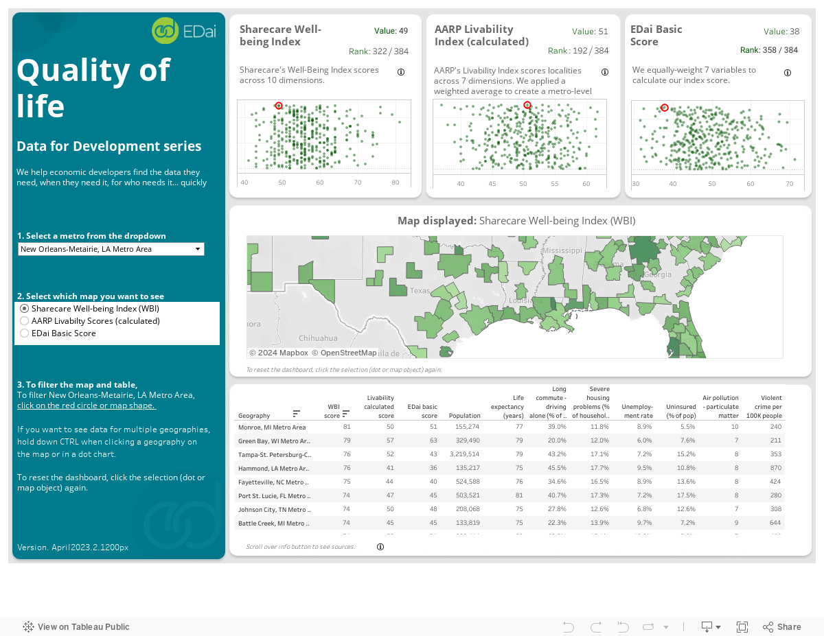
This dashboard takes a different approach. We compile three independent indices — Sharecare Community Well-being, AARP Livability, and EDai's own weighted scoring — and let you compare metros across all three simultaneously. EDai's index uses the same min-max scalar methodology as our Location Scoring engine, letting users adjust variable weights to reflect what actually matters for their workforce or their project.
The question this dashboard answers
"How does my community stack up as a place people actually want to live — and how does that answer change depending on who's asking?"
Sharecare Well-Being Index
A nationally recognized community well-being index measuring physical, financial, social, community, and purpose dimensions across U.S. metros.
AARP Livability Index
AARP's multi-factor index covering housing, neighborhood, transportation, environment, health, engagement, and opportunity — with particular weight on aging-in-place considerations.
EDai Weighted Scoring
EDai's own min-max scalar index across 100+ variables. Equal-weighted by default, but adjustable — users can shift weights to match their workforce profile or project priorities.
About the data
Sharecare Well-Being
Sharecare Community Well-Being Index. Measures five dimensions of well-being: physical, financial, social, community, and purpose.
AARP Livability
AARP Livability Index. Covers housing, neighborhood, transportation, environment, health, engagement, and opportunity across U.S. communities.
EDai Scoring
EDai min-max scalar index. Variables scored against each other within each dimension, then equally weighted to calculate the composite index. Methodology mirrors the Location Scoring engine.